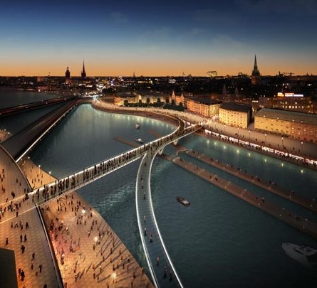
Foster + Partners, the well-known architectural bureau from Britain, will create the project of reconstruction of quay in Stockholm.
Works are conducted in common with the Swedish architects from Berg Arkitektkontor. Architects intend to dismantle a part of the motorways lying over a surface of water which will replace with the foot paths connecting areas Södermalm and Gamla Stan.
The purpose of works — transformation of the central city zone in tourist, two new foot bridges will open for visitors very interesting and historically important city quarter, form system of movement for pedestrians and bicyclists.
If you're looking for interior design inspiration for the hotels, following one of the best examples photos of Mandarin Oriental in Barcelona. You will see the design and elegant decor in the hotel rooms (entrance and lobby, master bedroom, restaurant, spa and indoor pool design, bar and lounge, etc), all combining Mediterranean, oriental and modern concepts. The Spanish hotel interiors designer Patricia Urquiola very bright and brilliant to work for this hotel.


Information about this Mandarin Oriental Hotel in Barcelona design by The Spanish designer Patricia Urquiola :
In keeping with Mandarin Oriental’s passion for working with creative and exciting design concepts, the prestigious Spanish designer Patricia Urquiola was commissioned to create the interior décor of Mandarin Oriental, Barcelona. The project reflects the open, cosmopolitan character of the great Mediterranean city where the hotel stands, along with the unmistakeable seal of Mandarin Oriental Hotel Group. The linear simplicity of the building, which was once the head offices of a bank, lends itself perfectly to the clean, balanced interior design by Urquiola.
Unique pieces
The spatial layout and furniture design, the ceiling decorations and the beautiful hand-woven carpets, reminiscent of the charm and distinction of great classical hotels, have all been carefully chosen by Urquiola. Nearly all the furniture has been specifically designed by the artist or adapted for the hotel in conjunction with such famous names as B&B Italia, DePadova, Flos and Moroso. From the Scandinavian style armchairs in Moments restaurant, the lobby sofa, which has been adapted from a traditional Chesterfield, the tartan carpet reminiscent of the Gentleman’s Clubs of bygone days which adorns the Banker’s Bar floor, to the fully restored early 20th century French ironing table which serves as a centrepiece to Blanc restaurant and lounge; each piece has been meticulously chosen or designed to give every venue its own character.
Rooms and suites
The hotel’s ninety-eight rooms sparkle in shades of cream and white, with avant-garde furniture sitting well alongside oriental details, such as large wall screens and wardrobes inspired by traditional lacquered Chinese boxes. Light oak floors and large bespoke beige rugs add warmth while the bathrooms, complete with oversized walk-in showers, are adorned with mosaics by Mutina and Bisazza that were conceived as magical boxes of coloured glass.
Entrance and lobby
An impressive atrium ramp draws passers-by from the busy central Passeig de Gràcia to the entrance hall of Mandarin Oriental, Barcelona from where guests can view the light filled Blanc restaurant and lounge below.
Blanc, the essence of Mandarin Oriental, Barcelona
Light is filtered in from the atrium and through large skylights positioned over Blanc restaurant and lounge, which is located on the lower floor, in the heart of the building. Possibly the most spectacular design element in the hotel is an enormous, rectangular, metallic grid which is suspended over the restaurant tables, allowing for greater privacy. Above this structure, a surprising “hanging garden” effect has been created by the addition of a number of plants.
Banker’s Bar and Moments
The Banker’s Bar and Moments restaurant are situated on the mezzanine level on either side of Blanc. The colourful décor of the Banker’s Bar features steel safes from the bank which formerly occupied the premises and which are now used to adorn the walls. At Moments, directed by the prestigious chef Carme Ruscalleda, hues of gold and amber predominate.
Mimosa Garden
The inner courtyard, otherwise known as the Mimosa Garden is one of Mandarin Oriental, Barcelona’s hidden treasures. Landscape architect Beth Figueras, in collaboration with Patricia Urquiola, was commissioned to decorate this unusual space. The result is a delightful garden terrace covering some 660 square metres, which has been perfectly integrated into the structure of the building. Colourful mimosas and other outdoor plants abound, while specially designed rope chairs invite guests to enjoy al fresco moments in this urban retreat.
The Spa at Mandarin Oriental, Barcelona: relaxing minimalism
A minimalist aesthetic is evident throughout the Spa at Mandarin Oriental, Barcelona. Dark wood detailing, black ceilings, white floors and the organic look of wet stone are predominant. Metallic curtains lead guests to each of the eight spacious and comfortable treatment rooms, where sophisticated period appliqués contrast with the overall simplicity of the space. In the pool area, a large malachite-green screen hides the Hammam from view.


Located on a flag lot, a steep sloping grade provided the opportunity to bring the main level of the house into the tree canopy to evoke the feeling of being in a tree house.

A lover of music, the client wanted a house that not only became part of the natural landscape but also addressed the flow of music.
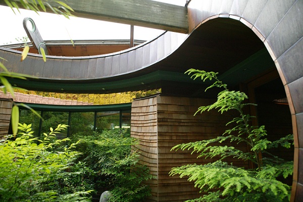
This house evades the mechanics of the camera; it is difficult to capture the way the interior space flows seamlessly through to the exterior. One must actually stroll through the house to grasp its complexities and its connection to the exterior.

One example is a natural wood ceiling, floating on curved laminated wood beams, passing through a generous glass wall which wraps around the main living room.
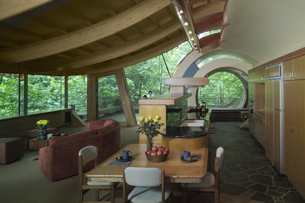

A lover of music, the client wanted a house that not only became part of the natural landscape but also addressed the flow of music.

This house evades the mechanics of the camera; it is difficult to capture the way the interior space flows seamlessly through to the exterior. One must actually stroll through the house to grasp its complexities and its connection to the exterior.

One example is a natural wood ceiling, floating on curved laminated wood beams, passing through a generous glass wall which wraps around the main living room.

below this design concept from my beloved friend when she make house architecture for Design Arts Utah 2010 Submission
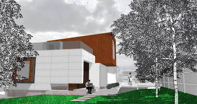

The exterior material pallet consists of corten steel, white steel, glass, concrete, redwood slats and cement board panels. Each material expresses their own unique relationship to the ideas of hidden beauty and meaning. While the tectonics of each material helps to contrast the others, they also complement each other - resulting in a fusing of material, textures and color.
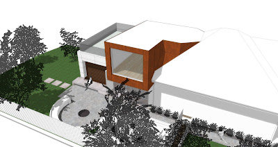
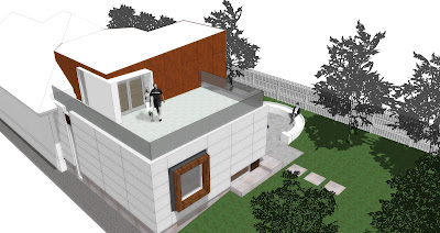
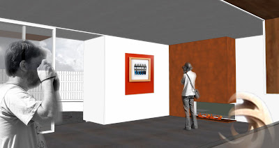
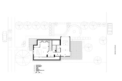
The main gallery space incorporates an open plan which allows for flexibility and improvisation in the gallery setup. Both paintings and sculpture can be on display. As one interacts with others and the art in the gallery a sort of performance occurs; not only the performance of the art itself but of everyday life, which is most clearly seen as the family of residence uses this space for their own leisurely and common activities. To encourage this “performance” the main space opens onto an outdoor patio and fire-pit. With this, the threshold between indoor and outdoor virtually melts away, allowing for a fusion between the built and natural environments.

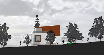
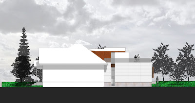
Occupying the upper level is the Master Bedroom Suite and outdoor patio. This geometric volume contains the sleeping area and is cantilevered away from the home, allowing a glimpse of the living space from the front of the home - playing a subtle game of “peek-a-bo”. A large window frames the exterior vegetation and acts as a transition between earth and sky.



Architects are often societal renegades with their own private visions and concepts of design. Close your eyes and picture rugged individualist Gary Cooper in the classic film The Fountainhead that was popular in the last century. After all, architecture is a statement of human progress, achievement and technology.
In keeping with usual visions and perspectives, consider this magnificent Japanese crystal brick structure that comes as close as any building can be to a custom-made, magical design that aims to please those who are paying for it.

Japanese architect, Yasuhiro Yamashita (Atelier Tekuto) aims to please his clients and loves the challenge of working with diverse people, materials and environments. This house was constructed with the idea that it would be as sunny and bright as the many crystals the client amassed as a hobby.
The glass blocks comprise the primary structure, which in itself is positively amazing. The actualization of this novel concept was the end result of collaboration with structural engineers, university experiments, construction companies and diverse manufacturing interests.
His thinking revolves around the concept of masonry; that is, architecture that stifles individuality and achieves totality by stacking identical objects on top of each other on the proposed structure. Glass block is not one of the more common elements used in masonry. More popular materials include: marble, granite, travertine, limestone, concrete block and tile.

Yamashita’s architecture conveys three concepts: society, the environment and function. In an effort to do his part in reducing the carbon footprint, he has become increasingly reliant on natural resources such as wood, soil and brick.
“I …create my architecture based on the system of society, the environment, the function, and the collaboration with people from various fields. … I now also focus on the relationship with other countries and regions. Recently I increasingly care for the environment by using natural resources… I continue to create new visions of architecture in different circumstances and places for the future”, says Yamashita.
In keeping with usual visions and perspectives, consider this magnificent Japanese crystal brick structure that comes as close as any building can be to a custom-made, magical design that aims to please those who are paying for it.

Japanese architect, Yasuhiro Yamashita (Atelier Tekuto) aims to please his clients and loves the challenge of working with diverse people, materials and environments. This house was constructed with the idea that it would be as sunny and bright as the many crystals the client amassed as a hobby.
The glass blocks comprise the primary structure, which in itself is positively amazing. The actualization of this novel concept was the end result of collaboration with structural engineers, university experiments, construction companies and diverse manufacturing interests.
His thinking revolves around the concept of masonry; that is, architecture that stifles individuality and achieves totality by stacking identical objects on top of each other on the proposed structure. Glass block is not one of the more common elements used in masonry. More popular materials include: marble, granite, travertine, limestone, concrete block and tile.

Yamashita’s architecture conveys three concepts: society, the environment and function. In an effort to do his part in reducing the carbon footprint, he has become increasingly reliant on natural resources such as wood, soil and brick.
“I …create my architecture based on the system of society, the environment, the function, and the collaboration with people from various fields. … I now also focus on the relationship with other countries and regions. Recently I increasingly care for the environment by using natural resources… I continue to create new visions of architecture in different circumstances and places for the future”, says Yamashita.
Located in a scenic Swiss village, “Scheider Chalet” comes from tecARCHITECTURE and completely turns the local architecture landscape around. The idea behind the design was to create a contemporary version of the classic Swiss chalet.This is an architecture style from Germany, which became popular amongst Europeans. The immense villa has a rather cold exterior, softened only by the green surrounding areas and the pool. The interior design however is very diverse and gives away a welcoming feeling. This is due to the wood finishes, the fireplace and a lot of interesting decorative items with a positive effect. We would be very interested in finding out what you think about the exterior design of this home.
The Truth About Interior Design
Have you ever wondered how you crapper make your home countenance same the locate of the affluent people? Or would you just same to create an impression of classic example with an air of sophistication?
All of these things crapper be made finished the use of inland designs.
Basically, inland organisation refers to the art of manipulating and forming the inner space of a house, an office, or a room, finished the management of surface healing and “spatial volume.”
Interior designs are generally used to bring in the features of architecture, furnishings designs, environmental psychology, and product design. All of these are combined to create an artistic actuation of the area in project.
The Style
The inland specializer should know and take into kindness the different parts of “design styles.” These are the proportion, function of design, concept, and balance. All of these parts are important in creating the amount “look and feel” of the room.
For instance, in creating the “look and feel” of the room, the inland organisation could enhance the “graphical individual interface” of the organisation buy using the right combination of colors, layout, shapes, etc.
Included in the aspect of styles are the heptad elements of organisation that an inland specializer staleness ever take into account. These are the shape, form, line, texture, color, pattern, and mass. All of these things, when incorporated in a project module bring out the best results.
However, good inland designers staleness also take into account the aspects of example in terms of its function and aesthetics. A good balance between the two module instigate comely coordination of all the elements of design.
The reason behindhand this argument is based on the fact that the concept of example is ever comparative and qualified. As the old adage goes, “Beauty is in the eyes of the beholder.”
Hence, there are instances that one organisation might be beautiful for one mortal but may countenance unsightly with others. That is why when the function of inland organisation serves its purpose as far as enhancing the amount outlook of the space is considered as universal, the comparativeness of its example module vary from one mortal to another.
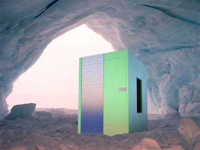
Living in a land filled with perpetual snow, we can only imagine that Santa Claus has some special magic to keep him and all his elves warm all year. For the rest of us, a stay in the North Pole requires proper equipment — like this arctic mobile unit designed by 2-B-2 Architecture's Andrey Bondarenko. The compact little unit operates off a solar battery and power generator and can keep its occupants safe and warm for 15 days, operating between -40 to +10C and withstanding winds up to 85 km/hour

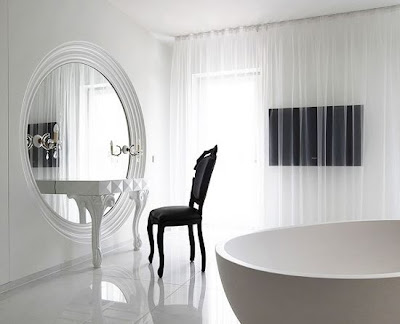
Marcel Wanders has designed the interior for the Casa son Vida, a luxury villa on the island of Mallorca. The building is composed of both old and new parts, with a new extension by Tec architecture. Their addition influenced Wanders' design choices for the interior, in which he wanted to complement the building by continuing to bring together historicaland contemporary elements. Round and square shapes, futuristic blobs combined with antiques result in a mix of traditional and modern references throughout the villa, with the play of reliefs and contrasting surfaces creating an unusual atmosphere.
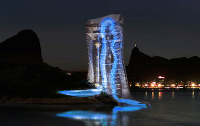
'Lighthouse tower' is a proposal by Mikou design studio for the Brazilian city of Rio de Janeiro. Designed as an arch at the entrance to the city, the tower is rooted on the island of Cotunduba and is accessible itself to the sea via a large jetty. It consists of observation points, an auditorium, skywalk, bungee jump platform, climbing tower, gyrodrop, cafétéria, souvenir store, urban balconies, multi-usage space.
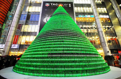
At the start of every Christmas season, environmentalists inevitably spark the real-versus-artificial tree debate. But this year, Chinese designers decided to take an entirely different approach to celebrate the holiday, crafting a huge tree from 1,000 Heineken bottles. The massive sculpture is currently providing some festive flair to Nanjing Road in Shanghai, China.
 This five star hotel is going under – underground that is! Designed by Reardon Smith Architects for a proposed development at Hersham Golf Club in Surrey, London, this new subterranean hotel will pay its ultimate respects to London’s Green Belt by placing all 200+ guest rooms underneath it! The entire scheme is covered with a plush green roof that takes its cue from the surrounding countryside.


Create Your Interior Design Painting
How the exclusive of your bag looks is just as essential as how the right looks. Sure you could argue that everyone sees the right while only you, your family, and your guests see the inside. Since you are the only ones who see the inside, it should emit your personality and be a pleasure for everyone. That's where having the right inland organisation craft ideas comes in handy. Each person has their possess individual sense of style and a artefact they envision their home. Paint is an inexpensive artefact to add personality and unique looks to any wall or room in your home.
It can be difficult to choose the exact artefact you poverty your inland walls to appear. With every of the do it yourselfers discover there today, there are plentitude of inland organisation craft ideas that hit been modified to be easy for the average person to create. One of the most popular techniques is sponge painting. By craft the desired walls a darker colouration than the accent colouration you are apace and easily able to create a marbled effect on the wall. Latex paints impact best for this job. You may poverty to experiment with assorted sized and shaped sponges on a disposable surface, like older wood, to find the effect you like the most.
Subscribe to:
Comments (Atom)


